


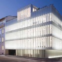
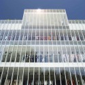
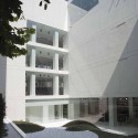
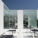
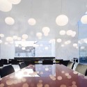
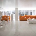
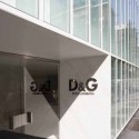
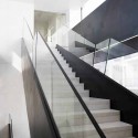
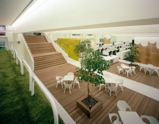
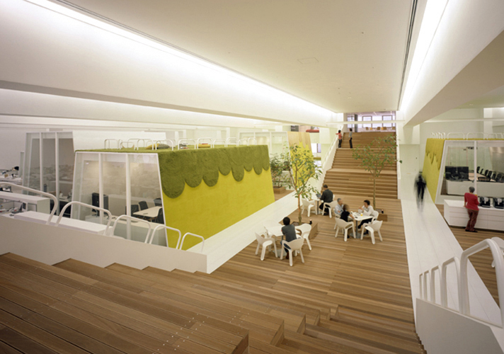
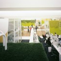
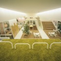
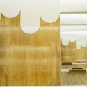
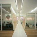
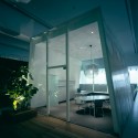
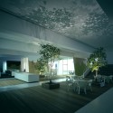
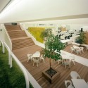
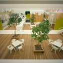
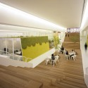
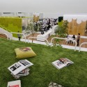
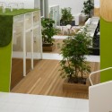
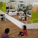
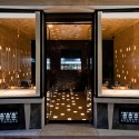
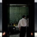
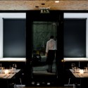
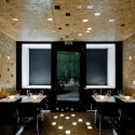
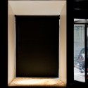
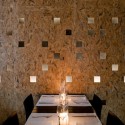
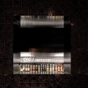
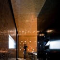
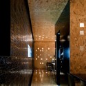
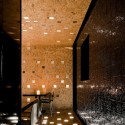
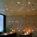
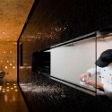
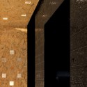
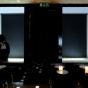
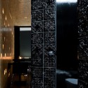
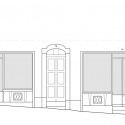
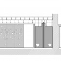
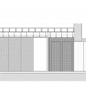
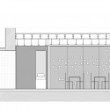
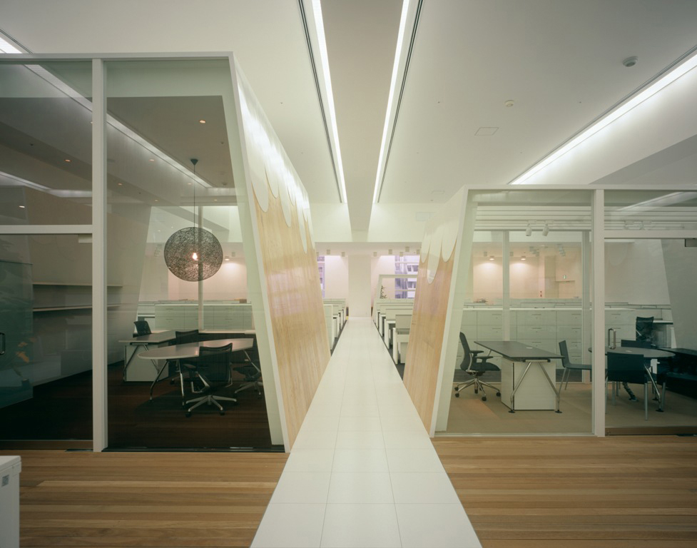
The new D&G headquarters in Milan contains the showrooms for the collections, offices, a restaurant and a series of image spaces, ina total area of 5.000 square meters. Two buildings dating back to the 1920s and the 1960s, facing three streets, are combined in a complex with five floors above ground and two basement levels. The project is based on an architectural principle of great rigor, with the use of natural materials like white Namibia stone, glass and unfinished steel sheet.
Architects: Studio Piuarch, Fresa, Fuenmayor, Garbellini, Tricario
Location: Milán, Italy
Constructed Area: 5000 sqm
Client: Dolce&Gabbana
Collaborators: Miguel Pallares, Luca Lazzerotti, Fortuna Parente, Magali Roig Liverato
Entrance furniture: Ron Arad Associates
General furniture: IT frames, MDF Italia, Vitra, Moroso, Arco Arredamenti
Lightning: Flos, Modular
Interior Stairs: Grazi Cristalli s.r.l.
Structure: FV progetti s.n.c – Ing. Filippo Valaperta
Foundations: Gtec s.a.s. – Andrea Zanotti
Exterior Façades: Sicef S.p.a.
Technical Services: IT impianti Tecnologici s.r.l.
Elecatrical Services: ELteknica s.r.l.
Contractor: Sice Previt S.p.a.
Construction year: 2006
Photographs: Ruy Teixeira

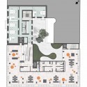
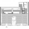
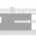
- showroom plan
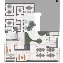
- offices plan
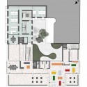
- restaurant plan
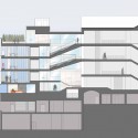
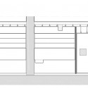
- section
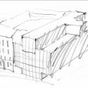
- sketch 01
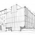
- sketch 02
'건 축 | 建築' 카테고리의 다른 글
| Sapphire Gallery by XTEN Architecture 2 (0) | 2009.07.02 |
|---|---|
| Armani Ginza Tower / Doriana e Massimiliano Fuksas (0) | 2009.04.16 |
| TBWA - Hakuhodo Offices / KDa (0) | 2009.04.16 |
| Restaurant 560 / joão tiago aguiar - acarquitectos (0) | 2009.04.16 |
| Brochstein Pavilion / Thomas Phifer & Partners, The Office of James Burnett (0) | 2009.04.16 |


