Architects: Jackson Clements Burrows Pty Ltd Architects
Location: Cape Schanck, Victoria, Australia
Project Team: Tim Jackson, Jon Clements, Graham Burrows, Kim Stapleton, George Fortey, Brett Nixon
Design duration: 12 months
Construction duration: 18 months
Landscape: Site Office Landscape Architects
Mechanical: Griepink & Ward Pty Ltd
Structural: Adams Consulting Engineers Pty Ltd
Contractor: BD Projects
Constructed Area: 400 sqm
Photographs: John Gollings


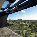
The undulating landscape at Cape Schanck is primarily a combination of cleared grass dunes (locally known as the Cups region) and expansive areas of dense Coastal Heath and Ti-tree shrub. The site is a designated wildfire zone and prior to the landscape being significantly cleared by early European farmers the area was inhabited by local aborigines.
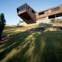
On our first site visit we discovered the remnants of a hollowed out burnt log. This informed a starting point for an architectural exploration for the interiors and exterior where the form of the hollowed log suggested possibilities for an architectural solution.

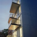
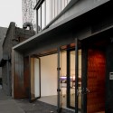
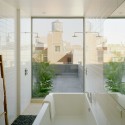
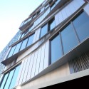
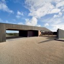
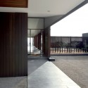
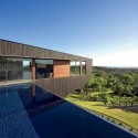
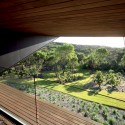
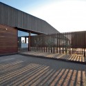
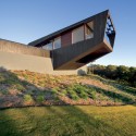
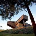
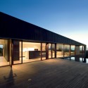
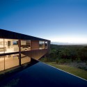
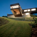
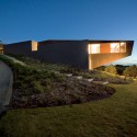
The site is located on a high inland dune amongst dense coastal ti-tree shrub with expansive western views. On approach, the visitor is fronted by an expansive wall which conceals the primary upper level form. The lower level extends from the steep ground plane as a rendered plinth and forms a base much like the surrounding dunes. A winding driveway climbs the steep dune accessing the upper level behind a screen fence which conceals the view beyond. From here the entry experience opens to expansive views over the living area, deck and pool.
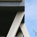
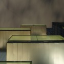
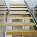
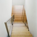
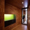
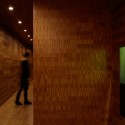
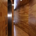
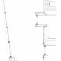
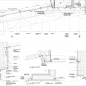
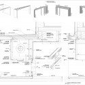
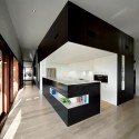
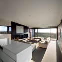
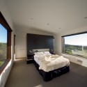
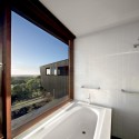
Programmatically the house considers the needs of a retired couple and their extended family who regularly visit with grandchildren. The primary upper level form (conceived as a hollowed out log) contains the kitchen, dining, living, garage and laundry. A secondary upper level form (conceived as a branch extending from the log) contains the study, master bedroom and ensuite. These forms are both finished in spotted gum hardwood cladding which is stained black. Cedar windows and cladding left in a natural finish are sleeved into the black exterior accentuating the difference between the interior and exterior as if part of a natural weathering process. The lower level contains guest accommodation and conceals functional plant spaces for mechanical systems and pool equipment.

The house is orientated to the northwest embracing expansive views. To control passive heating in summer, the western windows are protected by extensive eaves and motorised external Vental louvre blinds automatically descend once the sun passes through the north axis. Extensive northern glass is also protected by sunshades which limit solar penetration in summer. Further sustainable design considerations include fully automated electrical systems to reduce unnecessary power drain, bore water for garden and pool use and rainwater collection to tanks for all domestic use - town water was available however the clients agreed that the connection was unnecessary.
This house engages with the landscape through manipulation of form, material and colour. The weathered black vertical cladding profile references the undercroft structure of the Ti-tree and upper level form extends from the hill at ground level rising to a ridge which then descends to the west. At distance, the cranked profile of the form responds to the undulating profile of the surrounding ti-tree scrub and immerses the building within its surrounds.
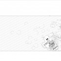
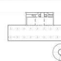
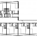
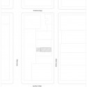
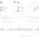
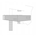
- site plan
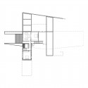
- basement plan
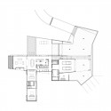
- ground plan
- roof plan
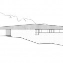
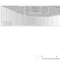
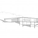
- elevation 01
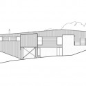
- elevation 02
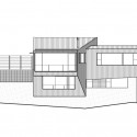
- elevation 03

- elevation 04
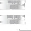
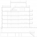
- section
'건 축 | 建築' 카테고리의 다른 글
| Shopping Roof Apartments / OFIS arhitekti (0) | 2009.04.16 |
|---|---|
| Tetris Apartments / OFIS arhitekti (0) | 2009.04.16 |
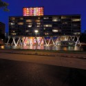
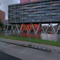
| de Plussenburgh / Arons en Gelauff Architecten (0) | 2009.04.16 |
| Switch Building / nArchitects (0) | 2009.04.16 |
| Planar House / Steven Holl Architects (0) | 2009.04.16 |